
Life Insurance eApplication UX refresh
Goal: The objective was to conduct research for Whole Life insurance consumer-facing eApplication to determine UX pain points and opportunities to improve conversions.
Mission statement: “SAVE THE APPLICANT”
Year
2025-Present
Team collaboration:
Life Insurance
Discovery
About whole life insurance eApplication (consumer-facing):
- Allows interest shoppers to buy guaranteed whole life insurance policy online
- Application can be filled and submitted using desktop or mobile devices
- Comprises of 5 steps: Personal information, Beneficiary, Payment, Review & Sign, Confirmation
Unfavorable analytical trends:
- Biggest friction in the process: Payment (using credit card)
- Exit rates were as high as 24% in desktop and about 20% in mobile at Payment page
- Users used to close the browser at the Review & Sign step without submitting
- Leading to tremendous loss of revenue (in order of $100K)
- Mobile traffic showed similar trends for Payment and Review & Sign steps
Research
Target audience:
- Prospective users who are trying to purchase guaranteed whole life insurance online
- Eligible users are between ages of 45 and 85 years
Exploratory research:
Goal: To determine the user pain points and observe the steps they take to fill out the eApp
Desktop Version (As-Is)
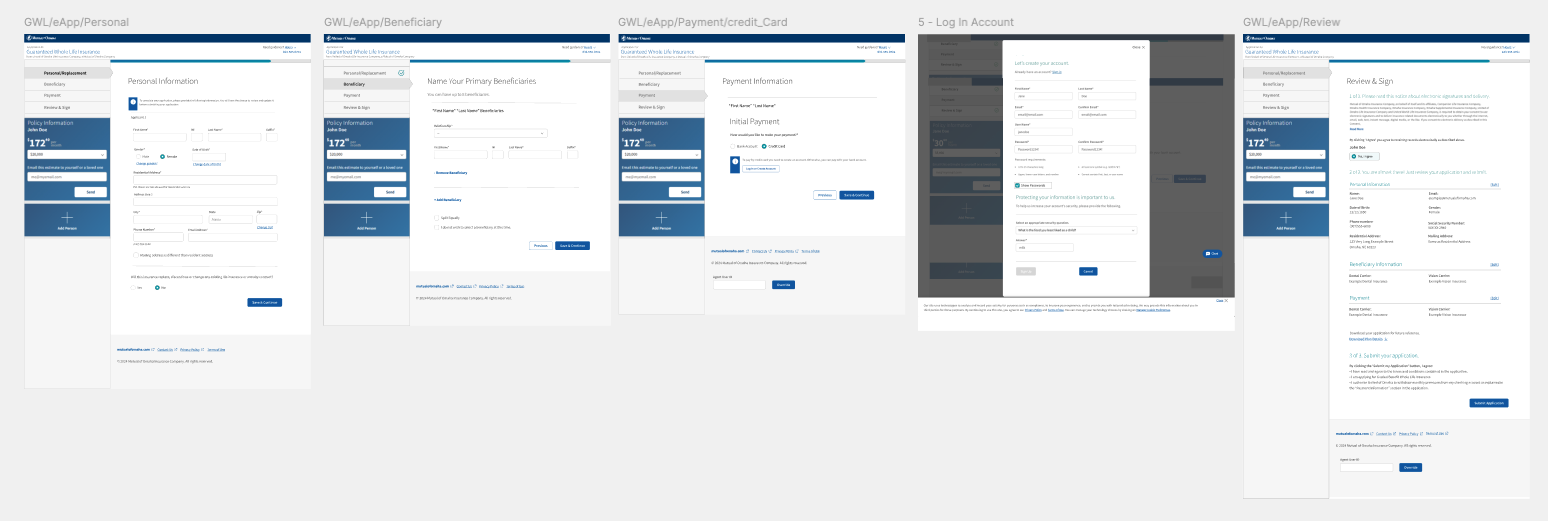
User pain points for desktop (As-Is)
Primary pain points
During the evaluation of the e-application experience, I identified several usability and information-architecture issues that were contributing to user confusion and drop-off. Instructional content, tooltips, and eSignature text were difficult to read across varying desktop screen sizes, and critical error messages often appeared outside users’ immediate field of vision, weakening system feedback.
Key UX Insights
A lack of clear typographic hierarchy caused users to miss essential instructions, increasing cognitive load throughout the flow. The credit card payment process introduced significant friction through mandatory account creation and Okta validation, disrupting task continuity. On the Review & Sign page, the content structure did not align with users’ mental models, leading many to overlook the primary “Submit” call to action and abandon the application.
Impact on User Behavior
Further pain points included the absence of the confirmation page in the global navigation and a progress indicator without clear stages or graduations. As a result, users were often unsure of their progress and whether they were close to completion, which contributed to incomplete submissions and early abandonment of the e-application.
Prototyping
Desktop Version (To-Be)
About whole life insurance eApplication (consumer-facing):
- Allows interest shoppers to buy guaranteed whole life insurance policy online
- Application can be filled and submitted using desktop or mobile devices
- Comprises of 5 steps: Personal information, Beneficiary, Payment, Review & Sign, Submit
Key UX Enhancements for desktop version(To-Be)
Error messages and instructional content were repositioned and restyled to improve visibility and readability across screen sizes. A new progress bar with clearly labeled stages was introduced to increase user awareness and reduce uncertainty throughout the application flow. The credit card payment experience was redesigned to remove unnecessary steps, eliminating account creation and reducing cognitive load. Content hierarchy on the Review & Sign page was restructured to align with users’ mental models, ensuring the primary “Submit” action was clearly visible. Finally, the confirmation page was integrated into the main navigation, providing users with clear closure and reinforcing completion of the e-application process.
Research
Target audience:
- Prospective users who are trying to purchase guaranteed whole life insurance online
- Eligible users are between ages of 45 and 85 years
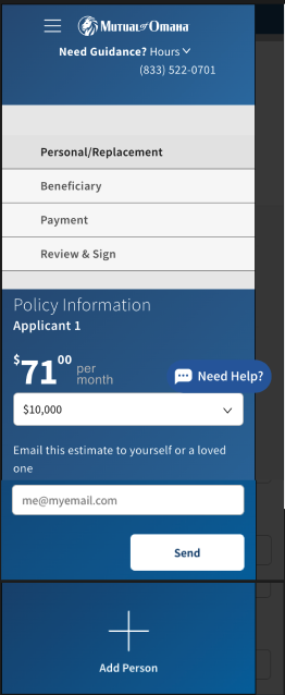
User pain points for mobile version (As-Is)
Primary pain points
During the evaluation, the most significant pain point emerged around the hamburger menu experience. The placement and visual treatment of the icon caused confusion, leading users to misinterpret it as navigation to pages outside the e-application. As a result, users intentionally avoided interacting with the menu and only accessed it when no other option was available. This behavior indicated a mismatch between user expectations and the menu’s perceived purpose, ultimately limiting discoverability of in-flow navigation options.
Key UX Insights
Because the menu was collapsible, users lacked visibility into the overall progress and required steps to successfully complete the e-application. They often entered the flow without guidance or awareness of what would come next, unless they explicitly opened the menu. This uncertainty increased cognitive load and reduced user confidence throughout the experience. Additionally, the credit card payment flow remained a consistent pain point at this screen size, further contributing to friction and hesitation during completion.
Mobile Version (To-Be)
User Testing:
- Created 2 different variations for the menu experience for mobile screen
- Conducted a preference (A/B) test with 20 participants for the designs to understand users’ expectations and ease of use
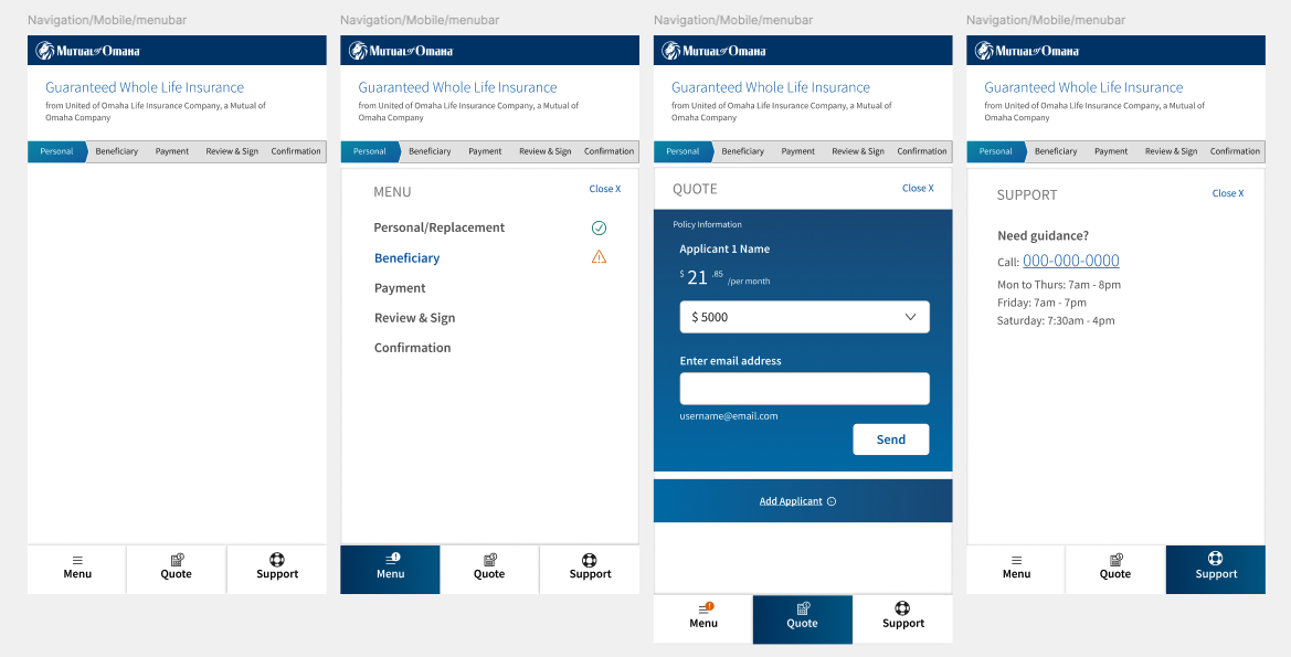
Key UX enhancements for mobile version (To-Be)
The menu bar was repositioned to the bottom of the screen—a familiar placement commonly used in other applications and one users could easily recognize and adopt. The menu was organized into three clearly defined tabs, allowing users to access key information without excessive scrolling or cognitive overload. In parallel, the progress bar was persistently displayed at the top of the page, ensuring visibility of progress at all times. This approach allowed users to open or close the menu without losing awareness of their current step in the e-application flow, improving clarity and confidence throughout the experience.
Next steps:
The research and design recommendations will be shared with the eApp team to review.